In Erasmusu.com we try to do our best, but we make mistakes, like everyone. The latest mistake we have done is related to UX design and I have learned something valuable with it.
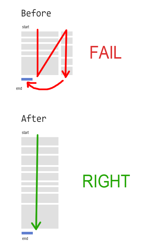
We have forms for our city reviews, accommodation ads, etc. At the beginning, we sketched these forms in one column, but in the final design, we tried 2 columns because it was nicer from the design point of view.
The problem was that the second column of the form, had required fields. So, what happened was that the user, after filling the first column and seeing the «Publish» button, was not realising that a second column needed to be filled too. We started to receive daily emails like: «Hey! I can’t publish on your site, it keeps saying me there are fields I have to fill». It’s important to say that we were actually pointing with a red coloured sentence where the required fills were, but many users were still not seeing them.
The reason because was hard for the users to publish content this way is obvious if you check out the image bellow. This is the path the user had to follow before and after we fixed the problem:

You may argue that WordPress uses two columns forms, but in WordPress the «Publish» button is on the right column, so you know that you have to go there. And more important: the second column has only optional fields.
So, our UX errors were:
- Using 2 column forms only because they looked nicer
- Placing the «Publish» button in the left sidebar
- Placing required fields in the right sidebar
Avoid that!
Interesting to read about (real-life) mistakes, and not only «good practices» 🙂
And I would add as well on your mistakes list: not test UX before real life. Although of course this is the just the theory and requires time and money. 🙂
Nice article Javi!